
HYUNDAI MOTOR FINANCE
This is a personal project. My goal was to design a clean, intuitive experience with a straightforward menu and a simple step-by-step process that makes it easy for users to find what they need.
Hyundai Motor Finance offers competitive financing products through a network of over 160 Hyundai retailers. This website isn’t focused on selling cars. its primary purpose is to help customers find financial support when purchasing or leasing a new vehicle, or when managing their payments.
I designed all elements in Figma and animated this in After Effects for this preview.
User research
I conducted user interviews with five customers. The main reason they visit the website is to make payments, though some mentioned occasionally checking for new offers. All five accessed the homepage at least once, and up to twice, per month -and over 95% of the time, they logged in right after landing on the site. Once logged in, users are taken directly to their account page. However, many felt the layout lacked structure and professionalism, making it seem like the tasks they were completing weren’t very important. Overall, users expressed a need for a more polished account and payment page, along with a better-organized menu.
January 2024 to May 2024
Duration
UI / UX designer leading responsive website design from conception to delivery.
My role
Conducting research interviews, paper and digital wireframing, low and high fidelity prototyping, conducting usability studie, accounting for accessibility, iterating on designs and responsive design.
Responsibilityes
The problem
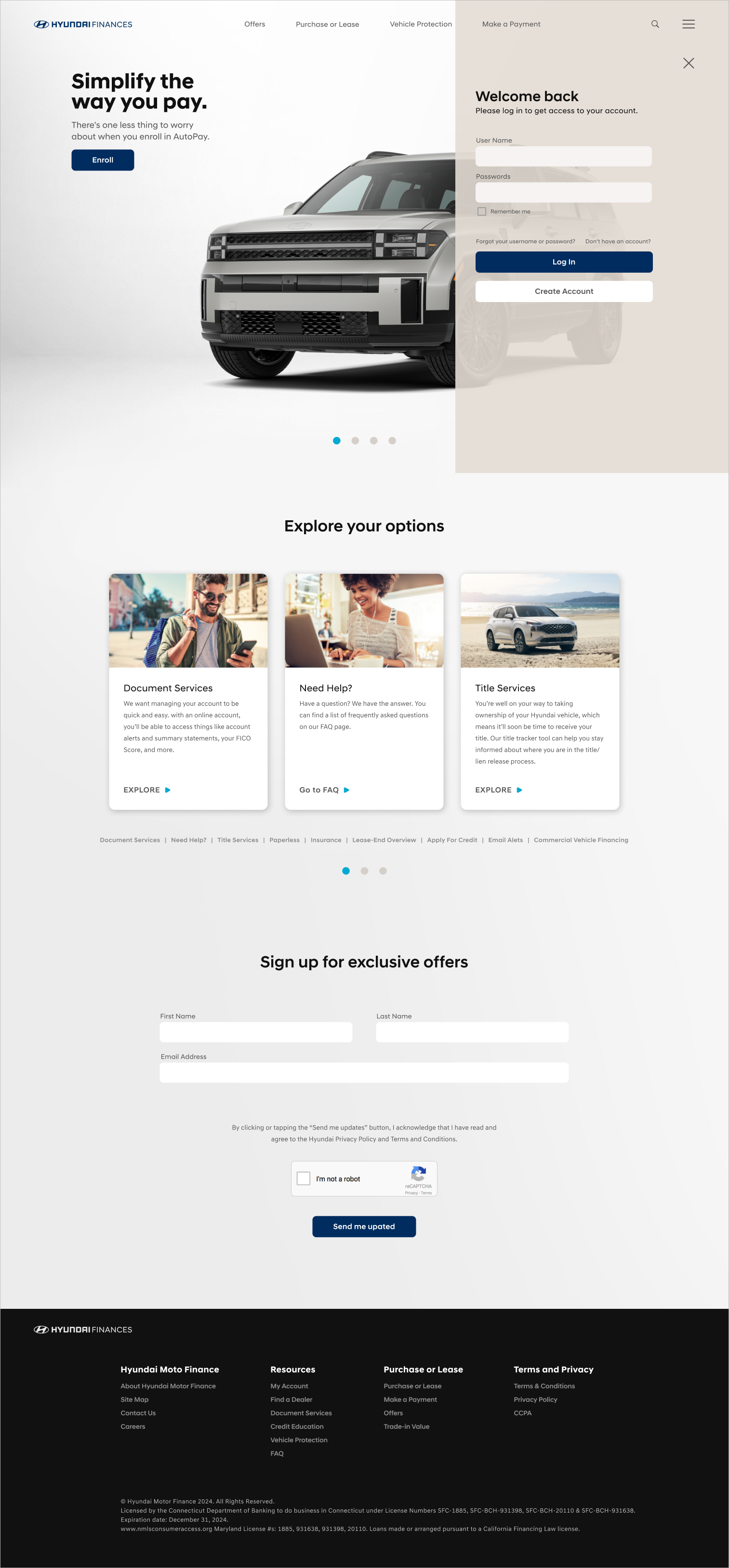
Currently, there are three different menu items, "Log In," "Your Account," and "Hello 000", that all link to the same account page. This feels unnecessarily repetitive. Once users reach the account page, their personal information and service options aren’t clearly organized, which can make navigation frustrating. Users often have to go through several steps to find what they need, and with so many clicks, they can easily lose track of where they started. This leads to confusion, especially when trying to repeat the process later. While it's not practical to place every option on a single page, it’s important to prioritize and clearly display the most frequently used and essential menus, so users can access them at a glance when they log in.
The goal
Unlike most websites, users on this platform begin their journey from the account page, making it especially important for that page to be well organized. I wanted the account page to not only clearly present the user's personal information, but also function as a central navigation hub. Instead of forcing users to click through multiple menus to find what they need, my goal was to place the most important and frequently used options directly on the account page in a clean, intuitive layout.
Pain points
Navigation structure
The same menus appear in multiple places throughout the site, but without any clear organization.
Cognitive overload
After logging in, users are taken to the Log In page, but there's also a "Your Account" menu in the top navigation. Since the Log In and Account pages look and function almost identically, it can be confusing for users to understand the difference between the two.
Excessive clicking
Even though there’s plenty of space on the page, information is often left out and placed on separate pages instead. Users prefer to reach their desired content with fewer clicks, without being redirected multiple times.
Pain point - Navigation structure

Several menus are repeated across the main webpage. For example, options like Log In, Documents or Lease, and Document Services appear in multiple locations. After logging in, menus such as Your Account, Document Services, and Log Out are also shown in at least two different places. This repetition can confuse users, making it unclear whether these options serve the same or different functions.
Sitemap
I consolidated the main menus and grouped related subcategories under each one. Using clear, non-repetitive labels was a key priority to make navigation simple and intuitive.

Homepage
I removed repetitive menus from the main page and prioritized the most important categories by placing them in the top navigation bar. Menus accessible to both visitors and account holders, without requiring login, are now clearly positioned in the top menu and the upper-right menu icon. My goal was to create a layout that feels clean, simple, and well-organized, improving usability for all users.


Pain Point - Cognitive overload
On the current Hyundai Motor Finance website, the "Log In" and "My Account" pages serve the same function. These two pages should be combined into a single, streamlined experience to reduce redundancy and user confusion.

Your account page
The functions of the Log In and Account pages have been integrated into a single flow. when users log in, they’re taken directly to the Account page. By introducing a slide -out panel design, users can now open and close their account page at any time. Frequently used features and essential menu options are clearly organized and easily accessible, creating a smoother and more intuitive experience.

Pain point - Excessive clicking
Once users log in, the Account page functions as a main menu panel on the right side of the screen. Users can select a menu item from this panel, and the content appears in the larger space on the left. This setup eliminates the need to constantly go back and forth to the Account page. If users want to expand the left-side content for a wider view, they can simply click an arrow to minimize the Account panel.


The most frequently used and important page by consumers is the “Make a payment” page. It’s simple and allows customers to check what processing they are currently doing and whether it’s completed well.
Make a Payment


High-fidelity prototype

Link
I designed for Website and app.
Responsive designs


Placed menus and labels in consistent locations to ensure predictable behavior, and used clear, descriptive labels to avoid confusion.
Accessibility considerations
Used high-contrast colors and large buttons to make touch interactions easier and more accessible for all users.
To improve clarity, I used boxed input fields for each blank, making the form easier to read and fill out.
Users are able to reach and use their account and payment pages quickly and efficiently.
Impact
What I learned
Some users aren’t comfortable using a mouse frequently, so I considered the size and spacing of interactive areas to ensure they’re easy to click or tap.